

Sunday, February 27, 2011
Saturday, February 26, 2011
Flower Pot Color Wheel

Don't forget to link up your project to my Monday Marvelous Mess party!! One project will be picked from each party to be featured on my sidebar for a week!!
I was totally inspired by my 1st feature this week on my Marvelous Mess party. It involved tin cans and paint to make a crayon organizer. SO cute!! I took it a couple of steps further and used mini flower pots (found at the Dollar store) and a plastic tray and painted it, mod podged it, and made it into a color wheel crayon organizer. :-) It's handy and it encourages some artistic thinking and education about color theory at the same time. Making something like this for your child (or having them help you!! ) and then teaching them about Primary colors and secondary colors (made by mixing primaries) will be a learning experience for both of you. Here is a little overview of Color Theory:
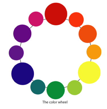
Primary Colors:
red yellow blue
Secondary Colors:
(red + yellow) = ORANGE
(red + blue) = PURPLE
(blue + yellow) = GREEN
Tertiary Colors:
Made by mixing one Primary Color + One Secondary Color =
The possibilitites are endless!!
Complementary Colors:
Colors opposite each other on the color wheel. Example: Red and Green. Just because the colors are complementary does not mean that they look well together....but they help something to "stand out".
Analogous Colors:
Colors right next to each other on the color wheel. Blue and green for example. These color usally go well together and make for a comforting peaceful feeling.
Warm Colors:
These are colors that subconsciously make us think of warmth and fire.
Cool Colors:
These are colors that make us subconsciously think of coolness and water.
Neutral Colors:
Browns (which are made by mixing the three primaries) and Grays (made by mixing black and white) are considered to be neutral colors. They are also called Earth tones. You will not usually see them on a color wheel. On mine above, I have painted the center pot white with gray and black polka dots and the plastic container has been painted brown.
Hues:
A hue is a "pure" color. Red, Orange, Yellow, Green, Blue, and Violet are pure colors that have not been modified by white or black.
Shades:
A shade is when black has been added to a a hue (or "pure" color). This progressively darkens a color.
Tint:
A tint is when white has been added to a hue. This lightens a color.
There, now you know enough about color theory to teach a very short class. :-)
I'll leave you with another picture of my fun little potted color wheel:

I shared this post at these fabulous funky link parties:
Get Your Craft On
Get Your Craft On


Friday, February 25, 2011
Where have I been?? Revamping my Bathroom.
This is one of the bathrooms in my house:

It is smallish and oldish and has a stand up shower-ish. We actually use it quite a bit because it is just so accessible (right next to the kitchen) and because our other bathroom is upstairs and we spend most of our time downstairs.....well, it's just not as convenient.
The downstairs bath has this warped and peeling vinyl that needed to go. We just haven't had the motivation. Well, those days are gone my friend.....a nice little gift card to lowes for Christmas changed all that. :-) We're going to tile the bathroom and repaint the walls and put up some new sheet rock and tile over the shower. Here are the tile colors:

The larger tiles are for the floor and the white tile will be going above the shower. I have to say: I would not have chosen that brown tile without some serious coercion. Coercion in the form of money.....we don't have a lot of it and this stuff was the cheapest. So, i have to make do with what we've got. After shopping for all of our supplies I picked out some paint to go on the walls. I was so proud of myself. I brought it home and immediately painted the walls (two nice thick coats) and then pulled out a tile from the box as an afterthought to see if it matched........nope. It desperately does not match.

It came out so much more *peachy* than sandy. It's actual name is Imperial Sands (I've been humming some of the Star Wars marches since I brought the paint home). Back to the drawing board. My hubby said, how about blue?? and I said "................................"
Blue is not an option on the table. :-)
Any ideas??
Here's how the bathroom looks now:
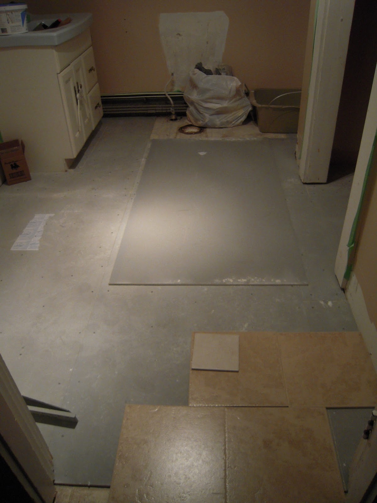
Washer and dryer are out and the cement board is down for the most part. We had an unfortunate situation with some plumbing.....so, we've got to wait for a plumber before we more further on this project. In the mean time my living room looks like this:
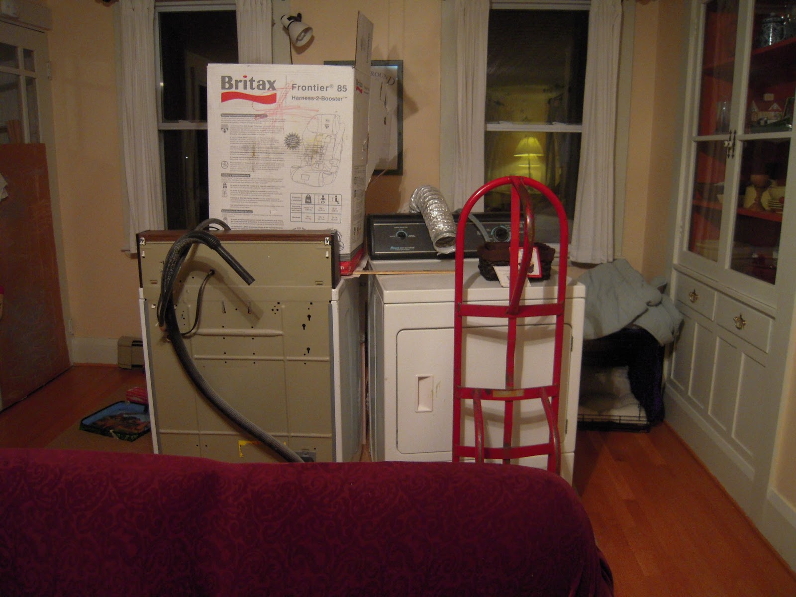
I can promise you that this does nothing for the feng shui of the room.
Subscribe to:
Posts (Atom)